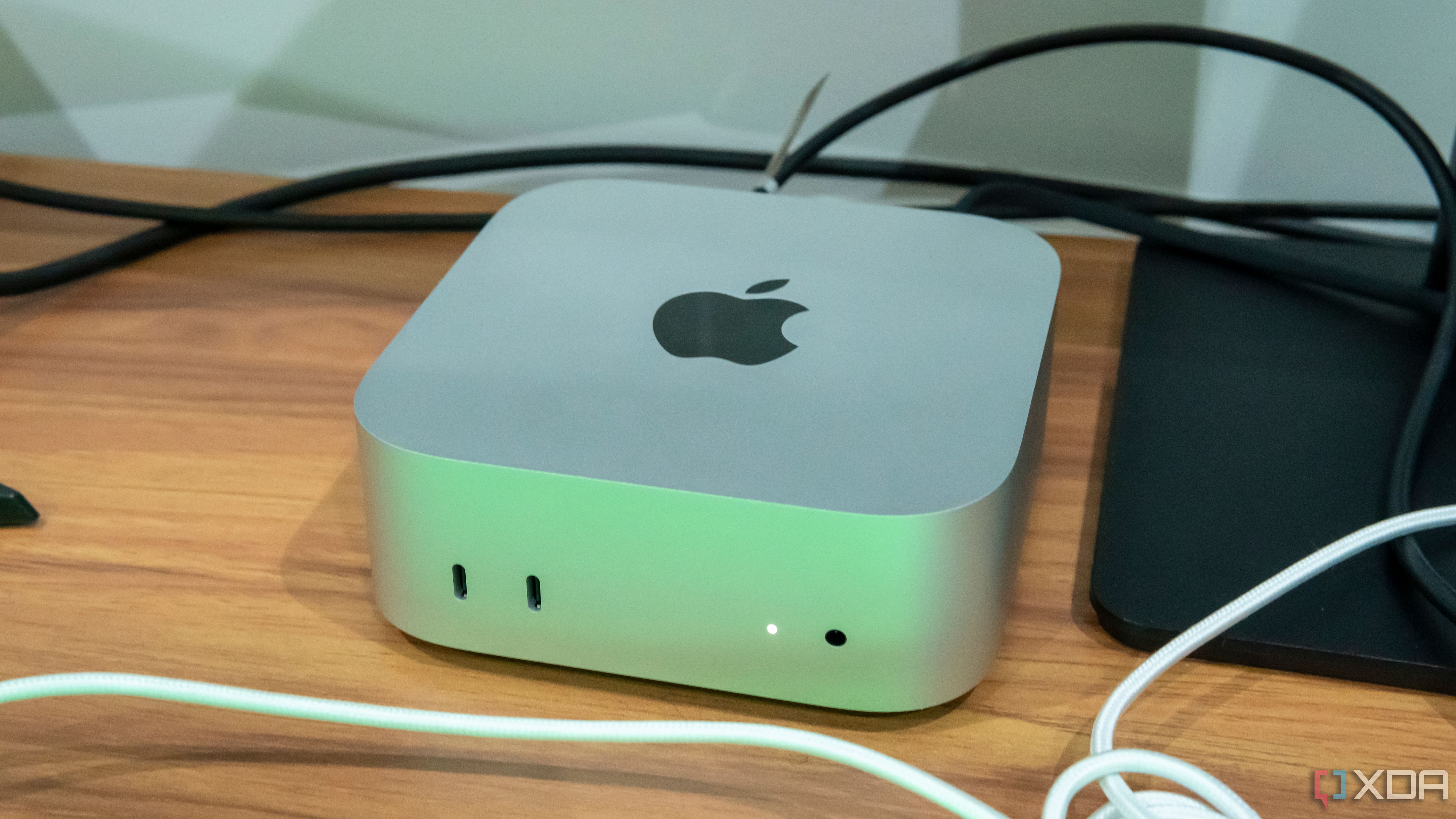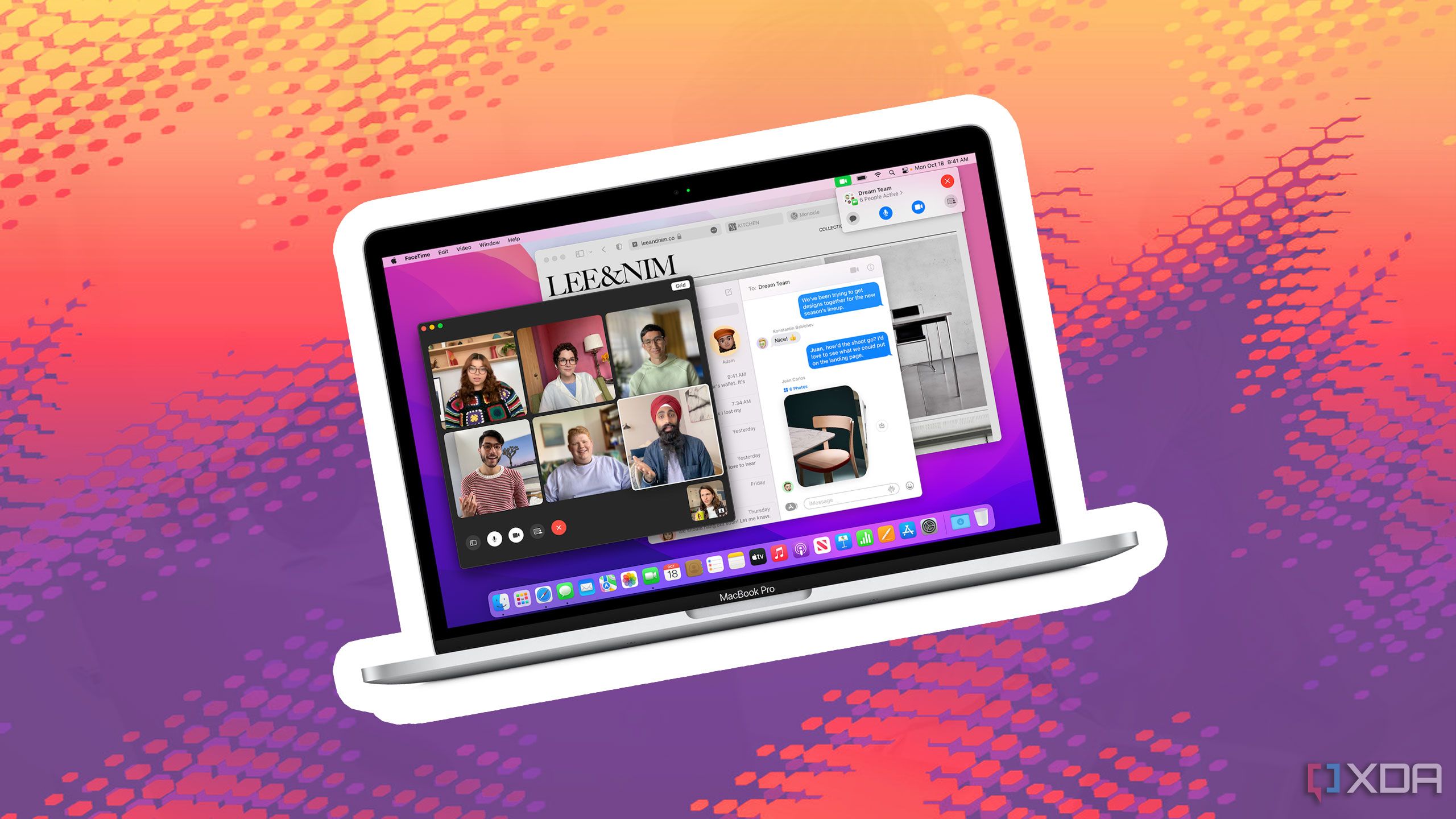
I recently received my first-ever Mac, the M4 Mac Mini, as a review unit (I’m working on it). While this device is incredibly impressive in many ways, including the outstanding performance I already covered, I’ve had more than my fair share of frustrations in this time. I’ve used Windows my whole life, so a lot of things here are new and took some getting used to.
I’m not here to say whether macOS or Windows is better — I’m not even saying these things are necessarily bad — but I thought it would be a fun experiment to share all the little frustrations I’ve experienced in my first time as a Mac user. Maybe it will help you decide if you ever want to switch, but mostly, we’re doing this for fun.
We tested it: Here’s how Apple’s M4 compares to Intel Lunar Lake and Snapdragon X Elite
Apple’s latest processor is no joke
10 Mail takes too long to sync
At least for the first couple of days
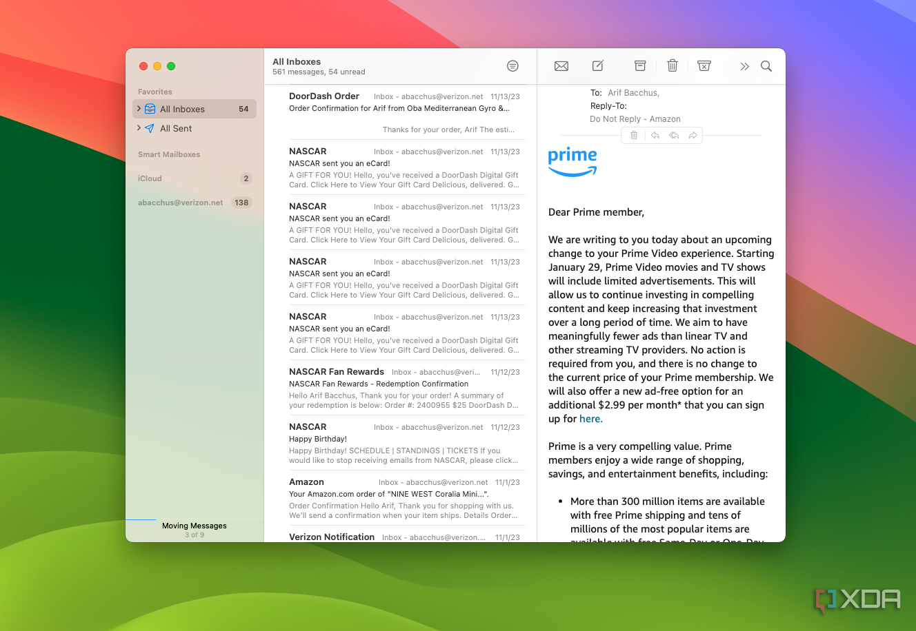
One issue I had in the first few days of using the Mac Mini has to do with syncing my email. I wanted to experience Apple’s software, so I set up the Mail app with my usual accounts. However, when I needed the email for some kind of two-factor verification, I noticed that the Mail app just took too long to sync, even after clicking the manual sync button.

Related
Why Spark is the best email client on Windows and Mac
There are few email clients actually worth using, but Spark is absolutely one of them.
It seems like the app may have been backed up trying to download all my mailboxes in their entirety or something, as things got fixed after a few days, but at the start, I just ended up opening the website for my email service or using my phone to get the codes I needed. I’ve never had that issue with other clients.
It feels unnatural
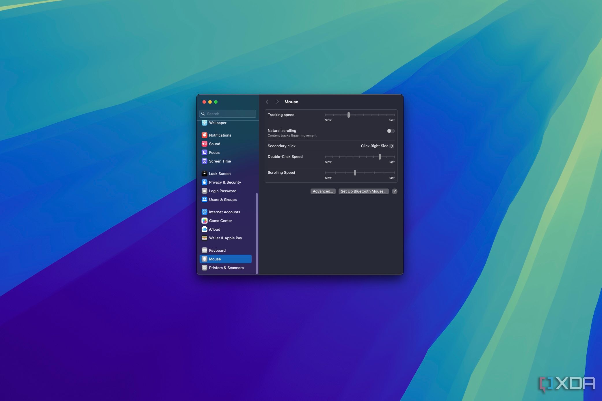
The first thing that struck me about macOS is that the default behavior for scrolling is the inverse of how it works on Windows. Scrolling the mouse wheel down moves the page up, and vice versa. This just feels wrong to me.
I kind of get it, because this kind of behavior is the default for touchpads in general, and Apple’s Magic Mouse also uses touch for scrolling. But the behavior just doesn’t match what I expect.
Thankfully, macOS does provide the option to change the scrolling behavior — something Windows 11 didn’t do until very recently, actually.
8 The power-on jingle
That was jarring
This may seem hypocritical considering Windows also has a little jingle when you get to the login screen, but something about the sound the Mac Mini plays every time I turn it on is very jarring. Unlike Windows, the Mac Mini plays the jingle almost immediately after pressing the power button, before the device is actually ready to use and before there’s even any display output coming from it.
I’ve gotten used to it, but it’s certainly a strange approach to the concept of a startup sound, in my opinion. And yes, I do turn my computer on and off every day, because I’m a normal person.
7 The Option and Command keys
The split takes some getting used to
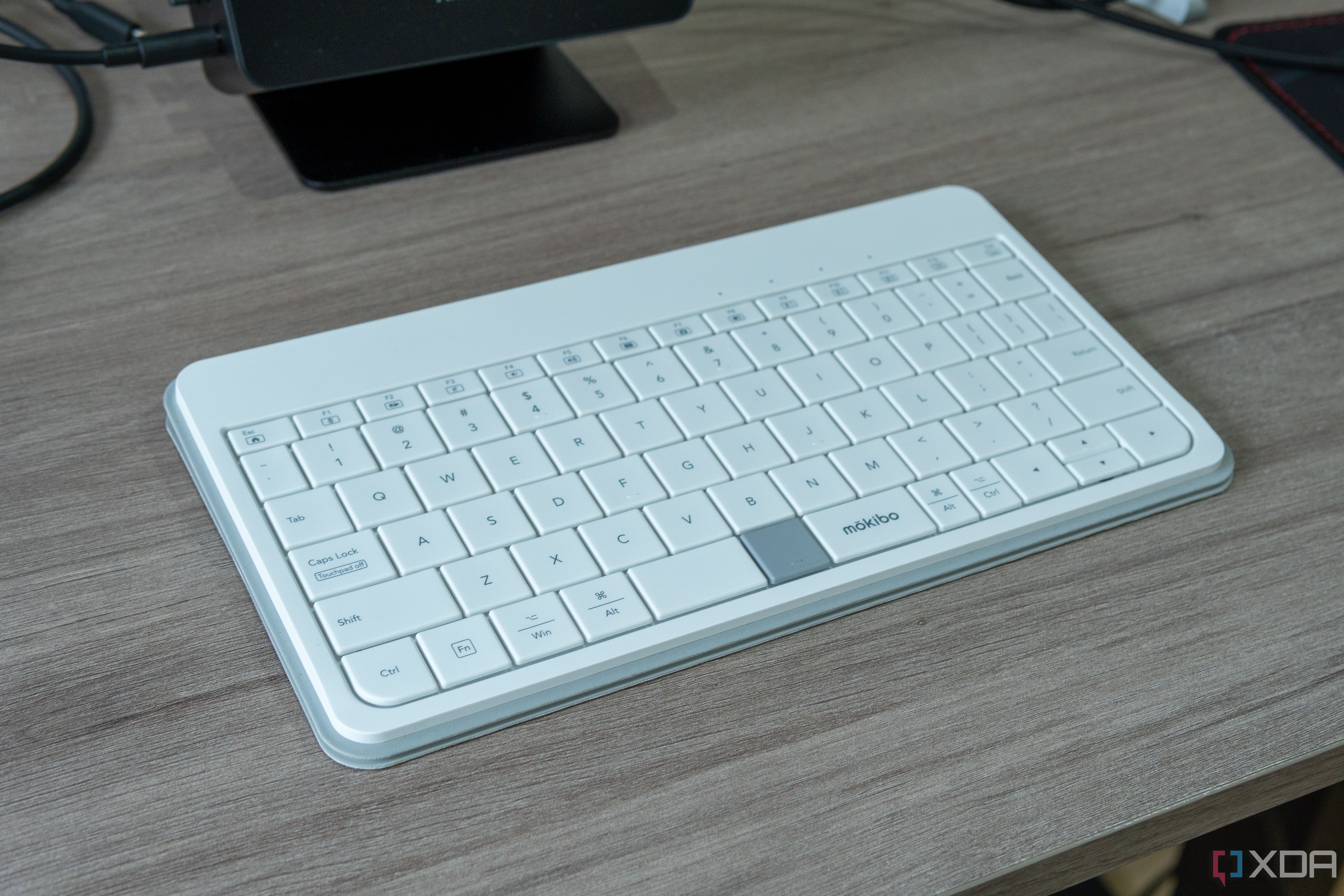
macOS comes with a very distinct difference compared to Windows, and that’s replacing the Windows and Alt keys on the keyboard with Option and Command. By itself, that’s fine, but the problem comes in with how commands I used on Windows are split between the two keys on macOS.
The biggest example is text selection and other text actions. On Windows, to select entire words at a time, I’d hold Shift, Ctrl, and use the arrow keys to move the cursor. Then, I’d use Ctrl + C to copy the text. On macOS, however, selecting one word at a time uses the Option key, while copying text uses Command + C. I was used to using the same key for everything, but now I have to adjust my thinking every time, and it slows me down a bit.
6 All the password prompts
Just let me use my computer already
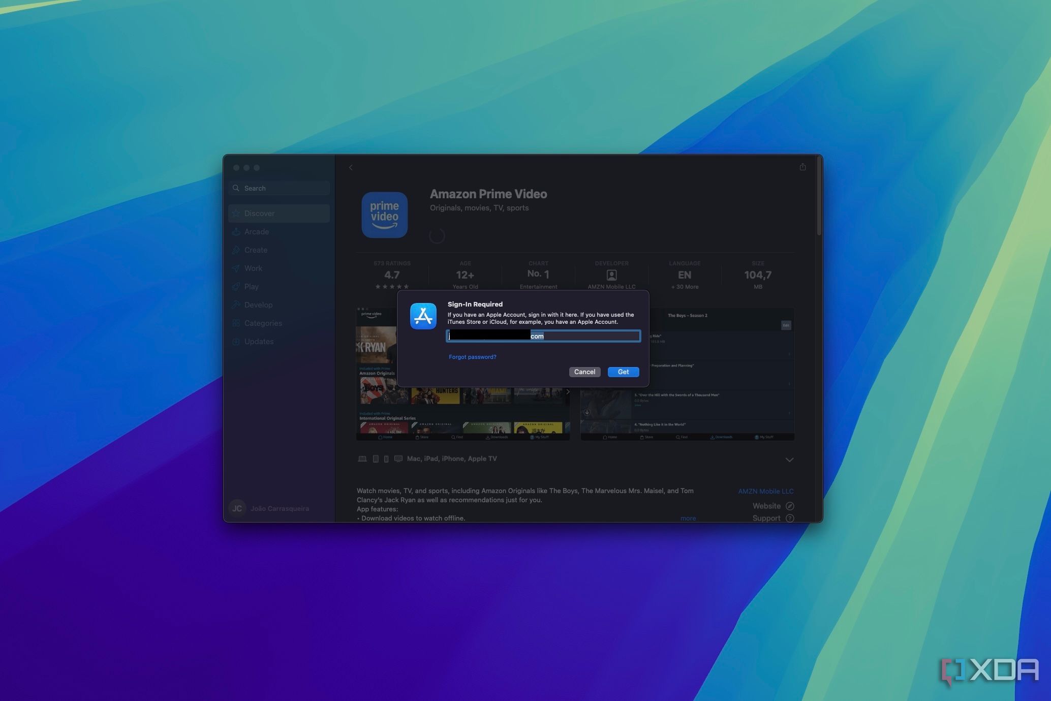
One of the most frustrating things about macOS so far has been just how annoying it is when it comes to doing anything that could be remotely deemed unsafe. Want to install a free app from the App Store? You need your iCloud password. Need to restart your PC to install updates? Enter your computer password. There are so many things that require you to enter a password on macOS and I just don’t understand it.
Is there really something that dangerous about installing an App Store app that’s free of charge? Especially when apps from the web can be installed just fine? I don’t get it. People complained about administrator prompts in Windows Vista, but this is something else.
5 Safari and pinned tabs
Managing my browser windows was a chore
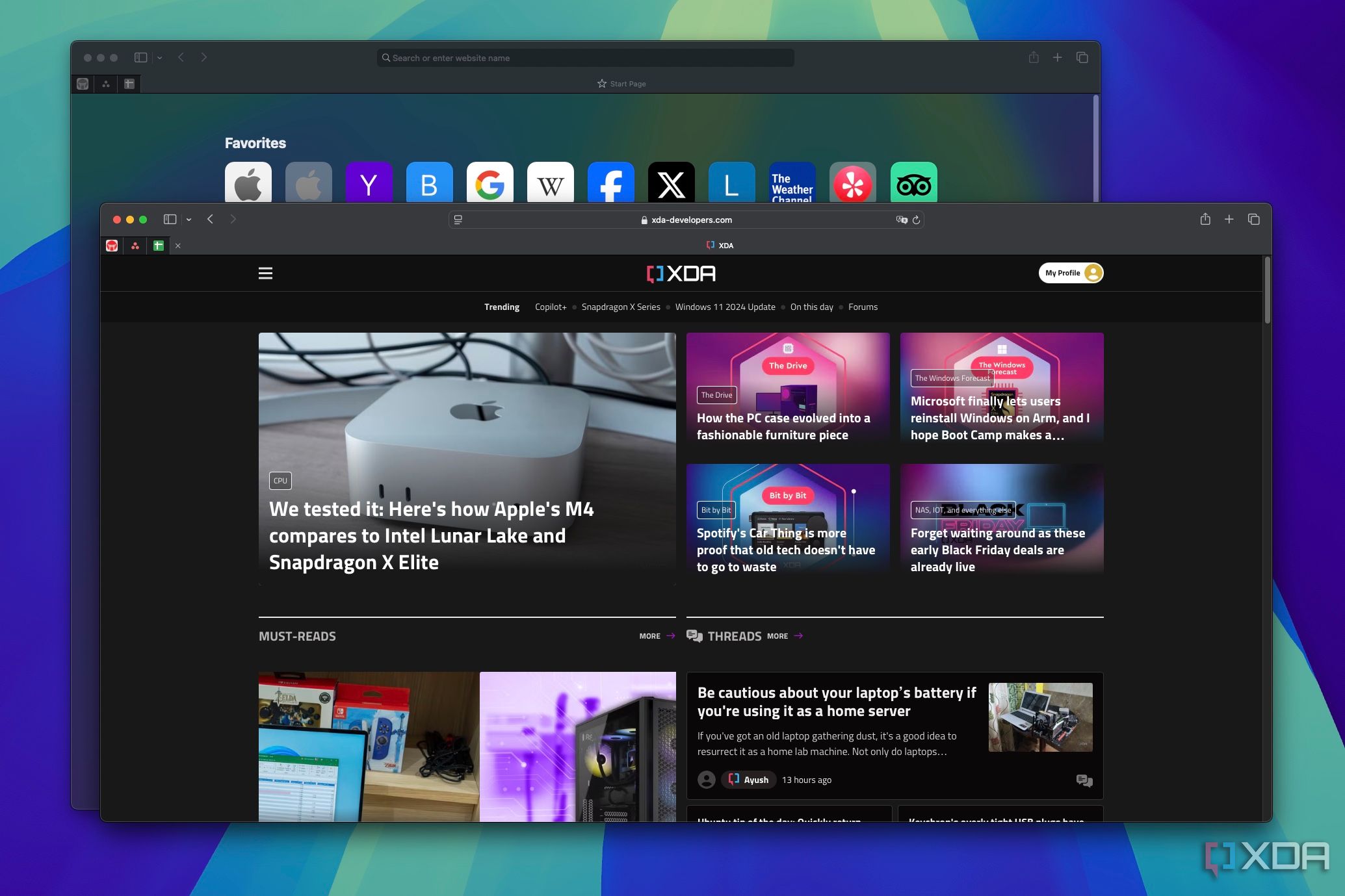
Apple’s Safari browser is another problematic app for me. I tried to get used to it, but I hate how Safari handles tabs, specifically pinned tabs. It’s impossible to have a Safari window open that only has pinned tabs, and those pinned tabs have to be shown on every window.
This became frustrating very quickly. Very often I’ll open a new browser window by dragging a tab out of the current window, or simply move a tab from one window to another. But in Safari, if the only remaining tabs are pinned tabs, dragged a tab out of the window will move the entire window instead. I have to create a blank tab just to be able to move the tab I want to a separate window.
Thankfully, this is easily fixed by using a different browser.
This doesn’t seem intuitive
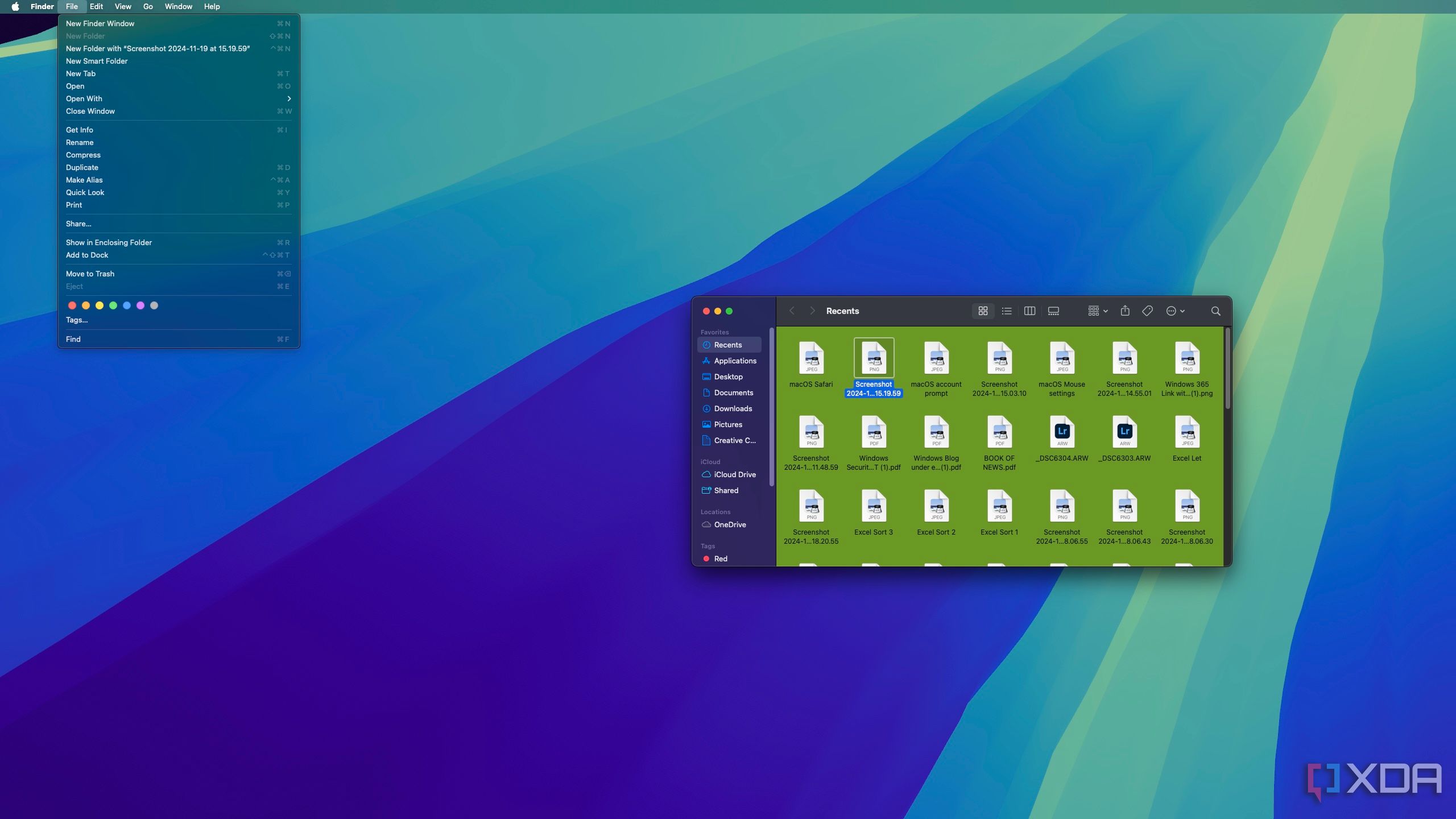
One of the hardest things to get used to, even after nearly two weeks with the Mac Mini, has been the menu system on macOS. The fact that all apps show their menu in the menu bar at the top just doesn’t feel very intuitive to me. On a standard 16:9 or 16:10 display, I can see how this would be workable, but with my 32:9 monitor. It’s very inconvenient to have to move my mouse all the way across the screen to reach the menu options that I’d usually get within the app window itself. Plus, having to first shift the focus to the window I want to work with to then use the menu bar at the top is even more annoying.
The only situation where this seems to make sense is when using an app in full-screen mode. But it’s even stranger considering full-screen apps hide the menu bar, too.
3 The dock and app management
I still don’t really get the point
Something else I really don’t like about macOS is how it handles the icons on the dock, which is the equivalent of the Windows taskbar. Icons on the dock seem to be split into sections, and I think one of them is for pinned apps, one is for recent apps, one has the trash icon, and if you have minimized windows, there’s a section for those, too.
So, recent apps aren’t necessarily apps that are open, but most of them usually still have a little dot under them indicating that they’re running, which is incredibly confusing. In most cases, clicking these icons just opens a new instance of the app anyway, because there are no windows open for that app. I guess the dot indicates the app has an open process in the background. Using the close button in an app window usually keeps the app in the dock, complete with the little dot under it. But the window you closed is still gone, so it won’t remember what you were doing.
It’s just a huge mess to understand what apps are still open and what apps aren’t. And that’s without getting into how confusing it is if you have multiple instances of the same app.
2 Installing apps
How am I supposed to know this?
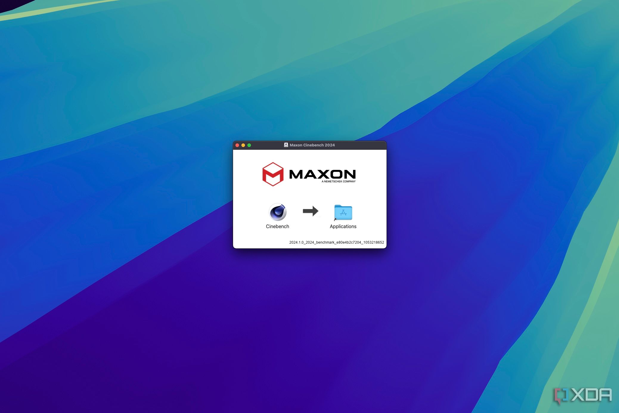
Another extremely confusing part of macOS was installing apps from the web, particularly those that come in .dmg format. See, DMG files are kind of like ISO files, in that they’re mounted as a virtual drive on the computer, and then you can install the app. It’s interesting that this is the default behavior for many app installers, but what’s really interesting is what happens next.
Being presented with a window that shows me an app icon and an Applications folder with nothing but an arrow in between was one of the most confusing experiences I’ve had doing something so simple. I clicked both icons and nothing happened, and there was no other button anywhere. A Google search later, I learned that I’m supposed to drag the app icon into the Applications folder.
Some apps actually have a .dmg file that tells you what you’re supposed to do, so that’s nice, but why is this behavior like this in the first place? Why isn’t there just an Install button? It’s still crazy to me.
1 Saving screenshots to the desktop by default
Just… why?
There are many questionable choices in macOS, but the one that’s the most unexplainable to me is that by default, for some reason, screenshots are saved to the desktop. Any screenshot you take just goes on the desktop to take up space.
Related
How to take a screenshot on a Mac in more than one way
There are several ways to capture frames on macOS
I can’t even begin to fathom why someone would want this behavior, and thankfully, you can change it. But the fact that Apple ever thought this was even okay just blows my mind. There’s not even a screenshot folder on the desktop, they’re just thrown directly onto it.
macOS has been a rollercoaster
Suffice it to say that getting used to macOS has been quite the experience for this lifetime Windows user. There are certainly things I like about this machine, but there have been many roadblocks to my enjoyment of macOS so far. That being said, my impression overall has been mostly positive, so stay tuned for the full review when it comes.

