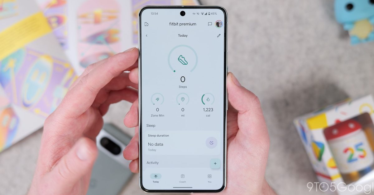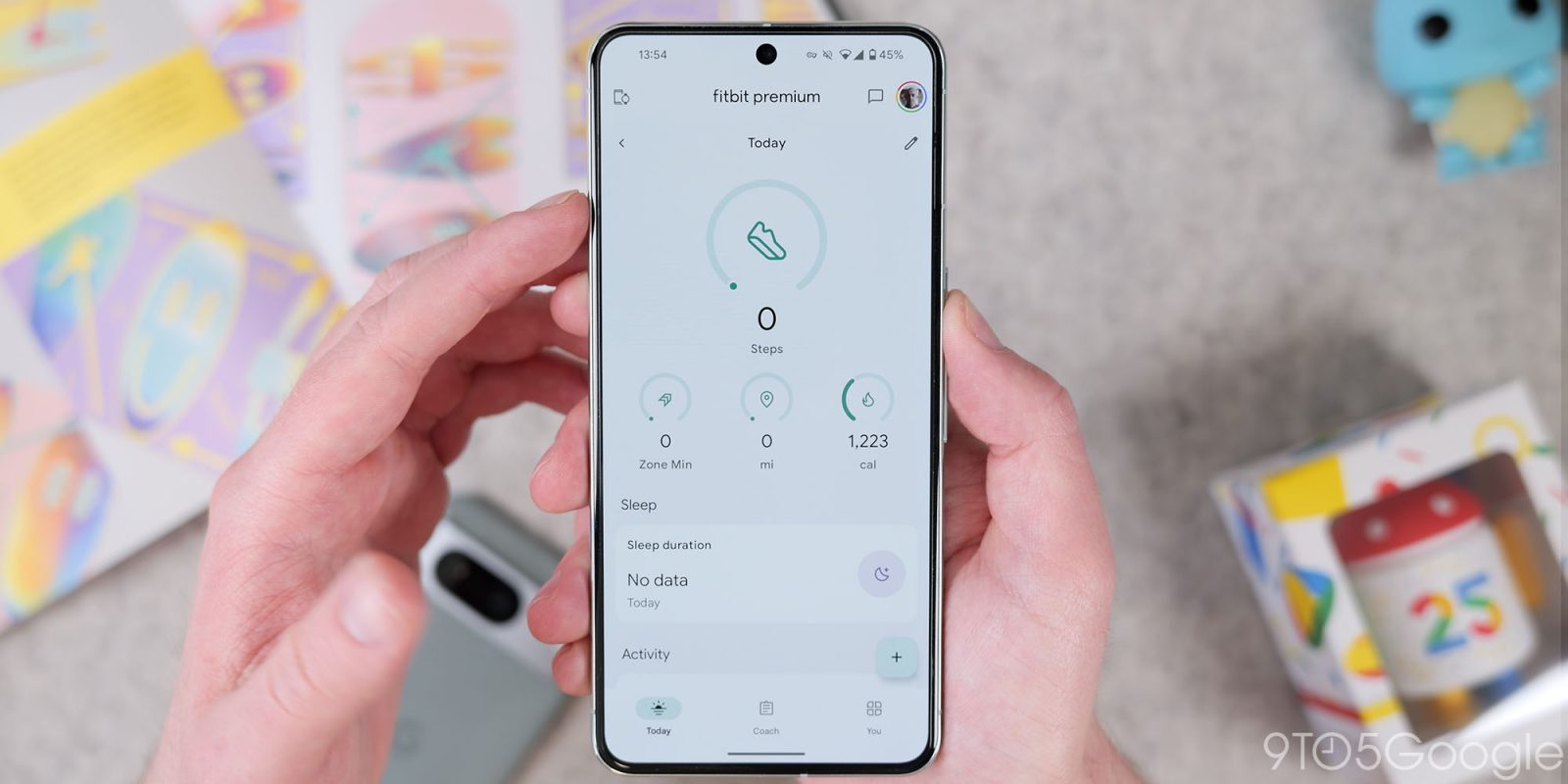

Fitbit for Android has seen a number of design updates in recent weeks, and the latest introduces a tablet and foldable layout.
Previously, Fitbit on large screens was just a stretched-out phone app.
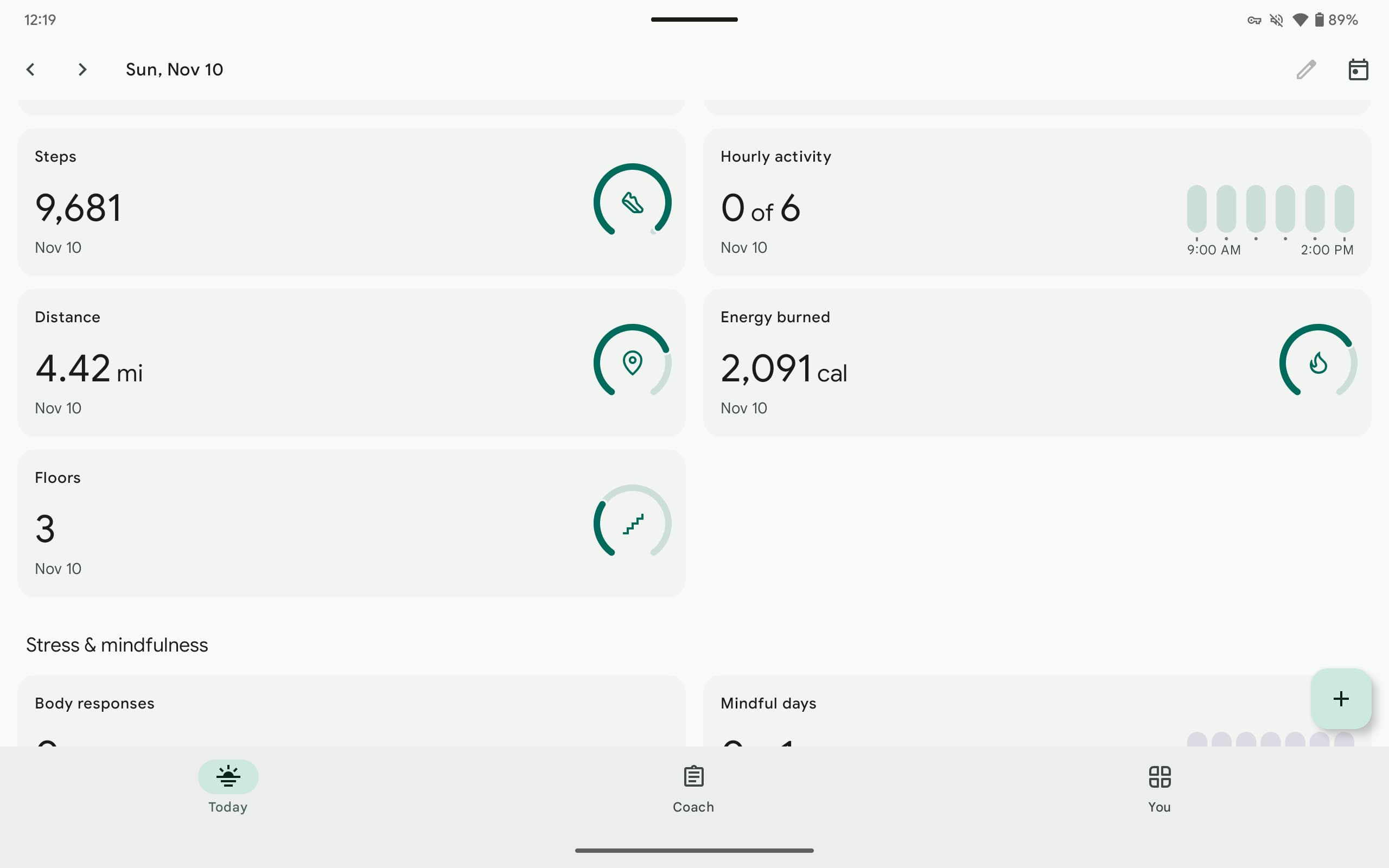
Now, the four customizable stat rings are laid out side-by-side instead of having one large circle and three small ones underneath. This design appears in both landscape (top) and portrait (bottom orientations.


Meanwhile, a single stat card no longer spans the entire width of your screen thanks to a dual-column layout that is a much more efficient use of space in landscape.
There are other layout tweaks, including the next/previous day controls, that optimize Fitbit for large-screen Android devices. These upgrades are specially nice for foldable owners.

We’re seeing these changes live with version 4.30 of Fitbit for Android, though this new tablet/foldable design might have rolled out earlier. Of course, the app still lacks a dark theme. Google is almost done migrating the legacy stat pages to the new design, so hopefully the night-friendly appearance will come after that.
More on Fitbit:
FTC: We use income earning auto affiliate links. More.


